You have seen the number. A bachelor’s degree is worth about $1.2 million more over a lifetime than a high school diploma. It comes from Georgetown’s Center on Education and the Workforce, I see it in admissions brochures and news segments, and I know of no single statistic that has done more to convince American families that college always pays.[1]
It is also not a return.
I spend a lot of time inside the research on whether college is worth it. On collegeroi.org I take the biggest studies apart one at a time, in separate pieces on Georgetown’s ROI rankings and College Payoff, the Institute for Higher Education Policy, and the New York Fed’s math. Here I want to step back and audit the whole field at once. Sort the studies into two piles and the real picture gets clear. It is neither the cheerful one the schools sell nor the cynical one the skeptics shout.
The first pile: numbers that are not returns
Start with the famous ones, because they are the weakest.
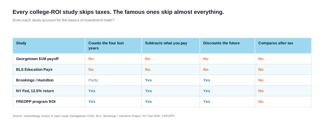
Georgetown’s million-dollar premium is a gross lifetime sum. It adds up what degree-holders earn and what high school graduates earn and reports the gap. Beyond that, it subtracts nothing. It does not subtract the cost of the degree. It does not subtract the four years of paychecks a high school graduate earns while the college student studies and borrows. It does not account for the higher taxes on the higher salary. And it does not discount, so a dollar earned at 60 counts the same as a dollar today, which is not how money or investing works.
Run those four corrections and the million-dollar premium shrinks. In my own model, which also counts living costs as part of the price, it can flip to a loss at the median, at full price and even at the net price families pay after aid. That is what the stricter arithmetic does, and I show the full recomputation in my standalone piece on Georgetown’s College Payoff. The short version is that the famous number measures the size of the prize and quietly ignores the price of the ticket and the years you spend standing in line for it.
The Bureau of Labor Statistics chart belongs in the same pile, the one that shows earnings climbing and unemployment falling at every step up the education ladder.[2] It is accurate, and it is a snapshot of where people ended up, sorted by the highest level each one finished, with earnings for those working full-time, no costs and no account of whether those people would have done well anyway. It describes survivors. It gets used as a promise.
These are the numbers in the marketing, and they are the easiest to take apart, because they were never built to answer the question a family actually asks. They answer what degree-holders earn. They do not answer whether this degree, at this price, is worth it for this student.
The second pile: numbers that actually try
Now the harder, more honest studies, and here I have to be fair, because the skeptic’s lazy move is to pretend everyone ignores costs. They do not.
Preston Cooper, at the Foundation for Research on Equal Opportunity (FREOPP), built the most rigorous version I know of. He works at the level of individual programs, tens of thousands of them. He subtracts net tuition, fees and books. He counts the forgone earnings. He discounts to present value. He even estimates what each student would likely have earned without the degree, and he adjusts for the real chance of not finishing. That is close to doing it right. But after all of it, he still finds a positive median return, roughly $160,000 for the typical bachelor’s program.[3]
The 2025 analysis by two New York Fed economists, Jaison Abel and Richard Deitz, does much of the same work and lands on a 12.5 percent return, which they note beats stocks and bonds.[4]
So is the skeptic simply wrong? No. The typical return in the rigorous data is high. The bigger story is the spread. In a companion piece published the same day, Abel and Deitz show that for at least a quarter of graduates the return is 2.6 percent or less, which they call a questionable investment.[4]
The median is real, and it is a disguise. It blends the petroleum engineer with the graduate in a field that has more degrees than jobs and reports the midpoint as if it were your future.
Run a stricter version of the math across the 1,679 four-year colleges with full data in my own model, one that taxes earnings and counts living costs as part of the price, and the price matters, but it does not rescue the weak schools. At full sticker price, only about one in five bachelor’s institutions clears the bar for the median graduate, so nearly four in five leave that graduate worse off than going straight to work. And that bar assumes the student finishes and earns the school’s median. Count the ones who drop out, and the gap only widens. Drop the cost to the net price students at each school actually pay after aid, and the odds improve but do not reach safety. Even then fewer than half clear the bar, and about 58 percent of institutions still leave the median graduate behind. Even when college is free, about 30 percent still do. Price moves the odds. The school and the program set the floor. The rigorous studies, read in full, do not say college always pays. They say it depends, and to me the spread is the whole story.
The flaw even the good studies share
There is one error that runs through all of them, the marketing numbers and the rigorous ones alike. The error is taxes.
Every study in both piles compares earnings before tax. But a college graduate’s higher salary is taxed at a higher rate, so the after-tax gap between the two paths is meaningfully smaller than the pre-tax gap, by more than a fifth over a career for the median graduate in my model. A higher salary you never take home is not a return to you. It is a return to the Treasury. Any complete analysis of an investment accounts for the tax treatment of its returns. The studies above, even the careful ones, skip it. My own model corrects for it, which is part of why its numbers land lower than the cheerful ones.
The degree or the person
A fair audit cannot stop at costs and taxes, because there is a deeper objection, and it cuts against my own side as much as anyone’s. How much of the premium is the degree, and how much is the person?
The students who finish college were, on average, different before they ever enrolled. More prepared, more advantaged, more likely to earn well on any path. So part of what many of these studies credit to the degree may simply be the people who got it. The best research here, from economists like Stacy Dale and Alan Krueger, finds that the earnings edge from attending a more selective college largely disappears once you compare students who were good enough to get into the same schools.[5] Selection, not prestige, drove much of the gap. That research measured a narrower question, though. It asked which college you attend, not whether you attend at all. The bigger question is how much of the college-versus-high-school gap is the student and not the schooling. There, the economist David Card’s review of the evidence finds that studies of identical twins put the part owed to the student, not the schooling, at about a tenth of the usual estimate of what each year of schooling pays, though Card notes the twin estimates vary from study to study.[6] Either way, unless a study adjusts for it the way Cooper tries to, some of the premium it credits to the degree belongs to the person who earned it, and I take up that debate in my book.
I do not raise this to argue college is worthless, and a review of the research by economists Philip Oreopoulos and Uros Petronijevic makes the same distinction. The returns to finishing stay real and meaningful for the students least likely to finish, the ones for whom the credential opens a door that would otherwise stay shut.[6] The premium holds up, and may even be largest, where it is least about prestige and most about access. But the selection problem means even the rigorous returns may be partly measuring the student, not the schooling, and a number that cannot separate the two should be read with humility.
What the audit actually concludes
Put the two piles together and the conclusion is not the one either side wants.
The numbers used to say college always pays are mostly not returns at all. They are gross sums and survivor snapshots dressed up as investment analysis, and the most famous of them can flip negative at the median under the stricter math, at full price and even at the net price families pay after aid. The numbers that do the math properly do not vindicate the skeptic either. They find a real but wildly uneven return, positive for most programs and badly negative for others. Taxes the studies leave out shrink it further, and a selection effect I doubt anyone can fully remove clouds it.
So the only honest answer this literature supports is one I rarely see in the marketing. It depends. It depends on the major, the school, the price you actually pay, and the student you are. A petroleum engineering degree at a low net price is one of the best investments I know of. A degree in an oversupplied field at full sticker can be a six-figure mistake. The single number that blends them is worse than useless, because it reassures the person about to make the mistake.
So stop quoting the million dollars, and stop quoting the BLS chart. Run your own number, for your school, your major, and your price, and decide from that. I make the gut-level version of this argument in a companion piece, College Is a Bet, which works out the student-level odds, completion risk and all, that sit beneath these per-college numbers.
Reference Sources
- Georgetown University Center on Education and the Workforce. “The College Payoff: More Education Doesn’t Always Mean More Earnings.” Center on Education and the Workforce, Georgetown University, 2021. Accessed June 15, 2026. The source of the $1.2 million lifetime premium, the gap between the $2.8 million median for bachelor’s holders and the $1.6 million median for high school graduates. The report states it did not apply a discount rate (full report, appendix).
- Bureau of Labor Statistics. “Education Pays: Unemployment Rates and Earnings by Educational Attainment, 2025.” U.S. Bureau of Labor Statistics, 2026. Accessed September 24, 2026. Median earnings and unemployment by educational attainment (“Education Pays”).
- Cooper, Preston. “Does College Pay Off? A Comprehensive Return on Investment Analysis.” Foundation for Research on Equal Opportunity, 2024. Accessed June 15, 2026. Roughly $160,000 median return for the typical bachelor’s program. Method: Cooper, “Higher Education’s Return on Investment: Methodology.” Foundation for Research on Equal Opportunity.
- Abel, Jaison R., and Richard Deitz. “Is College Still Worth It?” Liberty Street Economics, Federal Reserve Bank of New York, 16 Apr. 2025. Accessed June 15, 2026. The 12.5 percent return and the companion finding that for the bottom quarter of graduates college may not pay. Companion post: Abel and Deitz, “When College Might Not Be Worth It.” Liberty Street Economics, 16 Apr. 2025. Method: Abel and Deitz, “Do the Benefits of College Still Outweigh the Costs?” Current Issues in Economics and Finance, vol. 20, no. 3, 2014.
- Dale, Stacy, and Alan B. Krueger. “Estimating the Payoff to Attending a More Selective College.” National Bureau of Economic Research, Working Paper 7322, 1999. Accessed June 15, 2026. The selective-college earnings edge largely disappears once comparable students are compared.
- Oreopoulos, Philip, and Uros Petronijevic. “Making College Worth It: A Review of Research on the Returns to Higher Education.” National Bureau of Economic Research, Working Paper 19053, 2013. Accessed June 15, 2026. On the larger returns to finishing for the students least likely to complete. The twin-study estimate of ability bias, about a tenth, is from Card, David. “The Causal Effect of Education on Earnings.” Handbook of Labor Economics, vol. 3A, 1999: “a small upward ‘ability’ bias – on the order of 10%.”
Further reading: the full recomputation of Georgetown’s, IHEP’s, and the New York Fed’s figures appears in separate pieces on collegeroi.org, on Georgetown’s two reports, IHEP, and the New York Fed’s math. The institution-level results come from my own model. You can run the return on any school and major at collegeroi.org.